3 Tips for Choosing the Best Leaves for Monoprinting

compare leaves for their printmaking qualities - linda germain
Can you identify which leaves will make better prints?

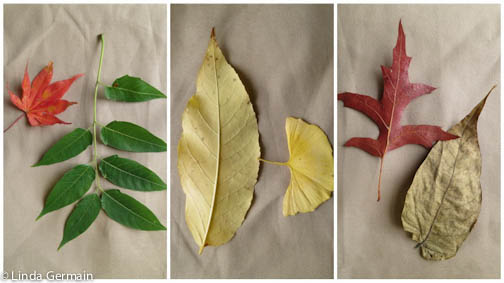
Lots of folks want to print with leaves, flowers and grasses. All natural materials are not the same. Some are better than others for printing on the glycerin and gelatin plate.

To get the most detailed and interesting impressions when making prints with natural objects I look for 3 qualities.

Printing with Leaves and Grasses

  1. Leaves with interesting negative space. That means I look at the shape around the leaf and ask myself it is interesting or boring.  Also if petals of the leaf touch each other then they will create one big space instead of separate petals. Do I want that?
  2. Texture on the back side of the leaf.  Are the veins prominent? Will they create a detailed mark? More mature leaves generally have more distinct veins.
  3. Strong but flexible.  Tender spring leaves usually flop and curl. They are hard to handle. Look for a sturdy flat leaf that with withstand, inking, moving and rubbing. Dried leaves are usually brittle and seem resistant to holding the ink.

Hope these tips help you with your next printmaking session with grasses and leaves.

Do you have other qualities that you look for when printing with objects from nature?  If so share them in the comments section and inspire us.

3 Tips for Choosing the Best Leaves for Monoprinting Read More »

Cover your journal with monoprinted fabric

monotypes on fabric - a project by linda germain
Quick and Easy project – Use monoprints to cover a journa and ENJOY!l

I have been wondering what the attraction is to working with fabric.

I think it has to be the personal, tactile nature of the medium.  You can feel it, touch it and even wear it.

Prints on paper are often under glass and we are discouraged from touching them.

Tell me in the comments: Why you love to work with fabric and printmaking.

Here’s a quick tutorial:

  1. Put strips of strong double stick tape on the outer edges of the inside of the covers of a stiff composition journal.
  2. Cut your fabric about 3/4″ – 1″ bigger all the way around the open journal. So you have enough to cover the back and the front and wrap 3/4″ – 1″ to the inside.
  3. Wrap one edge over and stick it to the tape,  as shown in the top right image.
  4. Carefully pull the fabric taut and then stick it to the tape. You want it to be flat and tight, but not so tight that it warps your journal.
  5. Snip the fabric at the top and bottom of the spine.  This will allow you to get around the pages.
  6. You can get fancy and miter the corners, or just snip out some of the excess and finger press the fabric flat.
  7. You could finish the inside covers with more tape and fabric.  I simply pressed the first and last page to the inside covers.

Now I get to see, touch, and enjoy these monoprints everyday.

Interested in gelatin printing your own fabric? Check out the online class Monoprinting Fabric.

Cover your journal with monoprinted fabric Read More »

Thermofax screen printing kit available soon

Are you curious about screen printing?

Do you want to add thermofax screen printing to your art making skill set? If so, then you may be interested in this starter set of printing screens that I am working on.

WATCH this video and see how I quickly print and layer one piece of fabric with several images.

Join the special interest list for thermofax screen printing and I will keep you up to date about courses, kits and videos that I develop about this fast and fun printing process.

Thermofax screen printing kit available soon Read More »

Does your printing process change with the seasons?

I have noticed that I do more printing with grasses in the fall, use Daniel Smith inks in the summer, need to clean my studio in the spring and use photo imagery in winter.

seasonal inspiration for printmaking with linda germain
Seasonal challenges of printmaking without a press

Summer:

  • Heat can dry up printing inks and the gelatin plate
  • Time – Do I go to the beach or play with the kids or print?
  • Fresh air means a great time to work outside and use those “toxic” inks

Fall:

  • Back to School – time to take a class and learn from others
  • Grasses are delicate but strong at this time of year – good for “stencils”
  • Orange, black and brown show up in my prints

Winter:

  • Cold temperatures can harden the gelatin plate and stiffen ink
  • Snow storms and short days mean it is a great time to connect with others in an online class
  • Minimal landscape inspires me to work with black and blue ink only

Spring:

  • Hope of all things fresh and new
  • Too early for tender grasses
  • But just the right time to purge the studio

Once I realized there was a flow to my printmaking, I could accept the limitations and embrace the opportunities that each season presents.  What about you? Share your seasonal wisdom in the comments below.

Does your printing process change with the seasons? Read More »